A Survey of Visualizing Business Data
By classifying business intelligence appropriately, we allow ourselves to spot opportunities for investment and exploitation, increasing our ability to turn the data and insight we collect into profit. Business intelligence and its research can be
divided into a taxonomy. This paper breaks that down. Even without data, are there areas that may contain similar opportunities?
3. Business Visualisation Articles
3.3. Customer Centric Literature
This section presents the two-part customer centric literature. Here, we examine visualisation research that focuses on the customers involved in the business, as opposed to the business itself. Table 5 shows the number of research papers appearing
in each business classification of the survey by year. We can observe a general increase in the number of publications over time.
Table 5. This table shows a temporal classification of the papers included in the survey by year. Primary papers included in the survey are labelled in green and secondary papers are labelled in yellow. See Section 1.5 for a description of our primary and secondary papers. The secondary classification used in the survey is shown in Table 1.
| Business Intelligence | Business Ecosystem | Customer Centric | |||
|---|---|---|---|---|---|
| Internal Intelligence | External Intelligence | Business Ecosystem | Customer Behaviour | Customer Feedback | |
| 1997 | Wright | ||||
| 1999 | Wattenberg | ||||
| 2003 | Gresh and Kelton Eick |
Brodbeck and Girardin | |||
| 2004 | Hao et al. | ||||
| 2005 | Burkhard | Woo et al. | |||
| 2006 | Vliegen et al. | Hao et al. | Merino et al. | Chen et al. | |
| 2007 | Keim et al. | ||||
| 2008 | Ziegler et al. | ||||
| 2009 | Otsuka et al. | Bresciani and Eppler Bertschi |
Otjacques et al. | Oelke et al. | |
| 2010 | Wu and Phillips | Wu et al. | |||
| 2011 | Sedlmair et al. | Basole et al. | Hanafizadeh and Mirzazadeh | ||
| 2012 | Kandel et al. Du et al. |
Ko et al. | |||
| 2013 | Aigner Broeksema et al. Bai et al. Lafon et al. |
Ferreira et al. | Basole et al. | Hao et al. | |
| 2014 | Nicholas et al. | Basole Deligiannidis and Noyes Basole and Bellamy Lu et al. |
Shi et al. Rodden Yaeli et al. |
Saitoh | |
| 2015 | Keahey | Basole et al. | Dou et al. Kameoka et al. Nair et al. |
||
| 2016 | Roberts et al. | Liu et al | Iyer and Basole Basole et al. |
Wu et al. Nagaoka et al. Sijtsma et al. |
|
| 2017 | Ghooshchi et al. Kumar and Belwal Bachhofner et al. |
Ramesh et al. | Schotter et al. | Kang et al. Fayoumi et al. |
|
| 2018 | Lea et al. Roberts et al. |
Basole et al. | Sathiyanarayanan et al. | Haleem et al. Saga and Yagi |
|
3.3.1. Customer Behaviour (CB)
The sub-category of customer behaviour encompasses literature that focuses on profiling customers or potential customers in an attempt to observe or predict customer behaviour. This type of analysis has become progressively more popular in recent years
due to the availability of suitable data (see Table 5).
Primary Data as Intentional, Active Digital Collection (CB): The following research conveys geo-location data collected through hardware that is used to track customer behaviour. Yaeli et al. analysed the movement of customers shopping in
retail stores. The data are collected from mobile devices capable of WiFi, NFC, and Bluetooth in the target area. Analytical visual interfaces are used to explore the customer path in the retail store. The analysis aims to provide a better customer
in-store experience and to improve business decision making.
Customer value is derived by combining the motion data with other meta-data such as point of sale information. Customers who visit the store more frequently or make more significant purchases are clustered into a group with the goal of targeting these
customers more. Other segmentation criteria taken from the original tracking data outline the customer's path through the store, e.g., in a department store, some customers browse the entire inventory while others go directly to one section of the
store.
The data used in the design are department store data. A geospatial map of the store is drawn with each department labelled. Customers are given an entry point and then arrows depict the path that each customer makes through the store. Contrary to popular
belief, it is shown that low-value customers are more likely to walk at random through the store, whereas high-value customers take a direct and efficient path around the store. See Figure 20.

Figure 20. These designs show the path taken for typical high value and low value customers. It is immediately evident that high value customers are more methodical in their walking path, possibly with a specific product to purchase in mind. Low value customers are more likely to randomly choose the next route direction. Image courtesy of Yaeli et al.
In-store path dependency analysis has been widely researched. However, there is no noted related work for the visualisation of these data.
Primary Data as Intentional, Active Research Study (CB): This subsection presents visualisation research that explores customer behaviour through research-based user studies – primary data collected by the visualisation researchers themselves.
Dou et al. presented an analytics system that provides insight into social, economic and behavioural issues through demographic analysis. An online survey is used to collect textual data along with the correct demographic information about the respondent
so that the predictive visitations can be tested. The software utilises a number of visualisation methods and their effectiveness is analysed and ranked based on their ability to predict demographic information.
The ultimate aim of this system is to answer three questions: What are different demographic groups interested in? Which demographic groups share interests? Can we successfully classify online users into the correct demographic?
To address the first question, a parallel set diagram is combined with a word cloud such that the user can see a customer segment or demographic (shown with the parallel set) alongside their interests (shown with the word cloud). The user can select a
demographic in the parallel set and the word cloud will update with that segment's interests. See Figure 21a). The cluster view maps each demographic against their interests to see if there is any overlap between demographic and interests. See Figure
21b). A tabular view shows the most common textual attributes associated with each demographic variable. This addresses the third question.

Figure 21. (a) Parallel set + word cloud visualisation; and (b) the User Cluster visualisation. Image courtesy of Dou et al.
Parallel sets are often used to visualise categorical or demographic data. Previous research focuses on the visualisation of text data without the linking of demographic data alongside them.
Hybrid Web-scrape (CB): The research in this section uses web-scraped data to derive and study customer behaviour.
Shi et al. presented a visual analytics system that tracks user search engine loyalty and the behaviour of users switching between different search engines. A new visualisation method "Flow View" is presented that develops its structure based on a flow
metaphor. A density map and a word cloud are also used to further the understanding of the customer loyalty behaviour. See Figure 22.

Figure 22. The Flow View of the LoyalTracker software. The depth of each layer represents the level of loyalty the users portray. Curved lines are used to convey the inflow and outflow of customers for each loyalty layer. The flow shows a weeks worth of data for each cycle in the visual design. Image courtesy of Shi et al.
Inspired by an infographic by an XKCD Munroe comic, the flow view presents user loyalty by separating the flow out into different degrees of loyalty. The transitions between these layers show the trending changes in customer loyalty. Highlighting the
link between loyalty and satisfaction, the density map plots loyalty on the x-axis and satisfaction on the y-axis. A word cloud displays the keywords searched in each search engine where transitions between search engines can be seen.
Web behaviour visualisation is a mature research topic. Trees have also been used to depict these data. Search engine switching behaviour has been widely researched, though Randall Munroe's webcomic XKCD inspired the visual design itself.
Sijtsma et al. presented TweetViz, a tool that utilises twitter data for the purposes of customer feedback and business intelligence. A dashboard approach is taken that visualises the geographical location of the business alongside the tweet feedback.
The user can select what company to view, and then all of the stores from that company are marked on the map. The sentiment of the tweets about these stores are computer and displayed to the user through the colour of a marker on the map. This system
enables the user to quickly find "problem stores" and then read the twitter feedback of the customers who have been there. User options provide filtering of customer demographics and competitor comparisons.
Twitter data have often been used for sentiment and business analytics purposes; the novelty of this application is that it collects customer opinions of physical stores and visualises the sentiment behind them, removing the need for a review to be explicitly
written.
Secondary Data as A Priori Database (CB): This subsection contains research that derives and depicts customer behaviour from pre-existing secondary databases. Woo et al. presented a method of conveying customer targeting data using a heat
map. This method depicts value distribution across customer needs and characteristics which helps the planning of a customer-oriented business strategy.
A pre-existing database appears to have been used for this research.
A customer need is interpreted as any voiced opinion about a product. This can be represented linearly by taking the volume of expressed opinions without a positive or negative correlation. The customer characteristic refers to a linear scale that can
quantify a customer. Using a number of metrics, customers are placed on a single sliding scale. The customer map is drawn on a 2D plane with one axis representing a key customer characteristic and the other a key customer need. Each customer will
occupy their own space on the x–y grid and therefore a heat map can be created to see where the customers fall. Clusters of customers can be identified as well as trends in the data.
Customer segmentation visualisation methods previously use neural networks to draw a self-organising map. Mulhern suggested a framework that emphasises the importance of segment-based target marketing as calculated by visually inspecting profit curves.
Hanafizadeh and Mirzazadeh presented methods for displaying market segmentation data to inform marketing strategies. Utilising a pre-existing database, clustering techniques alongside self-organising maps are used to segment customers into behavioural
demographics. Each cell of the SoM grid is coloured using a combination of RGB values which are derived from the attributes associated with the customer such as education level or income. These customer nodes are arranged into clusters, isolating
groups of similar purchasers. This segmentation enables the user to see distinct groups of customers and the motivation behind their purchases.
The self-organised map was introduced by Kohonen in 1981 and is used to present data of high dimensionality. The maps have previously been used to present business-related data.
The self-organising map was more recently explored by Kameoka et al. who continued this area of research by visualising customer segmentation data, as opposed to market segmentation data. The dataset that was used contained over 100k members of a
Japanese supermarket loyalty scheme. The SoM clusters loyalty club members into unique categories which can be used to more effectively market selected products to the different groups.
Wu et al. presented "TelCoVis", a visual analytics system that highlights behavioural patterns in potential customers through data obtained from China's largest telecommunications company. This system focuses on co-occurrence (people from two regions
visiting the same urban space during the same time span). See Figure 23 on page 38.
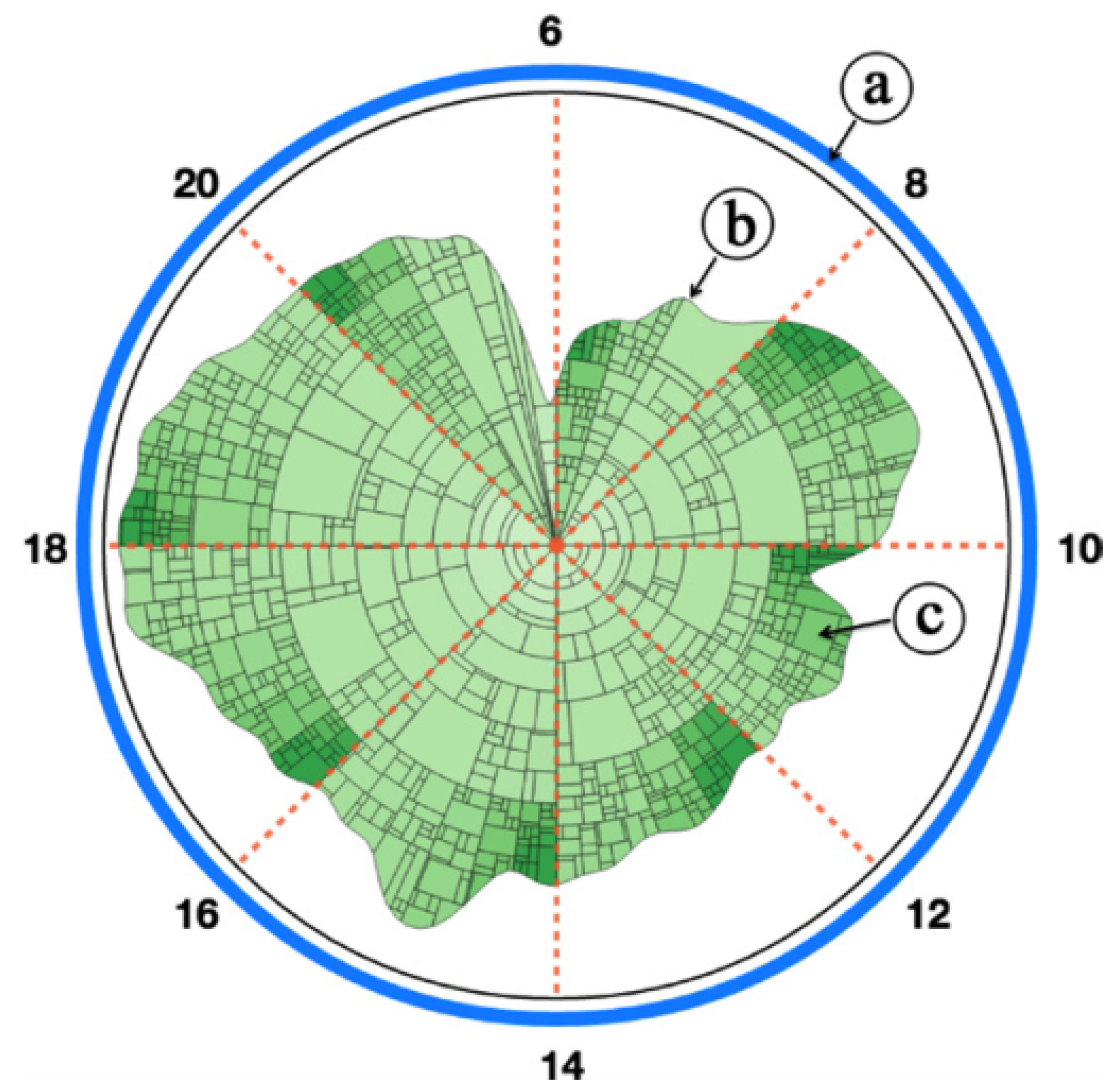
Figure 23. The contour-based treemap view: (a) the circular segmentation of time throughout the day; (b) the temporal contour of visits to a given location.; and (c) each sector represents a home location of the visitors during the time frame. Image courtesy of Wu et al.
They used two visual designs to convey this data. Firstly, a contour based treemap view that divides radial space into time segments and renders a contoured treemap within the space representing the distribution of visitors in that area. Secondly, a geospatial
heat map shows the flow of people into and out of a given area. Domain expert feedback attests to the usefulness of these in the context of business intelligence.
The visualisation of mobile phone data is an established area of research. Deville et al. presented population mapping, the data have even been studied for the purpose of fire and rescue services. The movement behaviour aspect often employs heat map-like
rendering to address the geospatial data as well as the intensity data.
3.3.2. Customer Feedback (CF)
This subsection discusses the visualisation of feedback data. The papers focus on aspects of the customer experience such as satisfaction or opinions. These visual insights aim to adapt the business product or service to better suit the customer expectations.Primary Data as Intentional, Research Study (CF): This subsection presents a paper that use interview studies to visualise customer feedback – data collected by the visualisation researchers. Broadbeck and Girardin presented a visualisation
tool that uses parallel coordinates combined with a tree structure to analyse customer feedback data.
The design of the tool maps the data to parallel coordinates and then implements a selection system that converts the customer survey data to a hierarchical structure by clustering questions by dimensions. The user can select subsets of the data according
to these dimensions. The three dimensions are quality criteria (questions), quality dimensions (segmented), and indices (individual data records). Primarily, the contribution lies in the combination of the data selection tool with the traditional
parallel coordinate diagram and the creation of an easy-to-use visual analytics system. See Figure 24. The tool primarily uses parallel coordinates but introduces a hierarchical tree nature to the data. Using the two together, brushing and
linking is also incorporated.

Figure 24. The three parallel coordinates represent each layer of the hierarchy. The file system tree-view below shows the data selection system where the user can choose subsets of the data to visualise. Image courtesy of Broadbeck and Girardin.
Hybrid Web-scrape (CF)
In the following, many research papers use web-scraped data to visualise customer feedback.
Ziegler et al. presented a system that analyses textual customer feedback data from an unspecified online feedback website. The system uses clustering techniques to analyse short segments of data-mined text to provide a quantitative context for customer
feedback. Treemaps are then used to convey these data and the nodes are automatically labelled. See Figure 25.

The top view of the visual layout provides an overview of the most frequently cited topics and issues by presenting them in clustered treemap nodes. Colour is mapped to sentiment and the size of the nodes is mapped to the volume of feedback within a given
cluster. Treemap nodes are formed from clusters of similar feedback. These nodes are labelled by the groups of words found within the clusters. To ensure that the labels are legible, the orientation of the label is rotated to match its longest axis.
Twenty-three people were shown the system and were asked if they were more confident with the treemap or being presented the data in a list format. Fifteen opted for the treemap while six indicated they preferred lists. Two users were indifferent. This
supports the use of visual interfaces in a business data analysis environment. The treemap design and layout is taken from Bederson et al. The textual analysis and clustering is based on the work of Ponte et al.
Oelke et al. presented an approach to visually analyse large quantities of customer review data scraped from online sources. The research takes a holistic approach to calculate the customers' opinions, breaking down each component attributed to the
product and producing an overall product score. The visual designs enable quick overviews to be made of the data as well as clustered comparisons of similar reviews.
The visual summary reports offer an overview of the customer feedback. Using a matrix grid that compares multiple products against a range of features, the design enables the viewer to look at either the most favourable product or their most valued attribute
to inform their purchasing decision. See Figure 26. The cluster analysis uses 2D scatterplots to categorise the reviewers. The table sizes vary depending on the number of people within a cluster.

Figure 26. The visual summary report. Each row represents a product (in this case, printers), and each column represents an attribute of the product. The internal square in each of the matrix compartments show how many reviewers commented on this attribute. Image courtesy of Oelke et al.
Chord diagram and parallel coordinate hybrid plots are used to show a detailed view of the data. The Hybrid can be used to highlight correlations between different attributes of the customer feedback. The left half of the chord circle shows the values
for each product attribute and the right half shows the product score. Edges that connect the two join via a centre axis that represents each product. Filtering processes enable the user to identify trends and observe the customer opinion of each
product.
Previously, Gamon et al. presented Pulse, a clustered visualisation technique for displaying customer review data. This calculates the average review per cluster and incorporates a treemap. Gregory et al. focused on sentiment analysis but did not only
calculate a positive or negative outcome. Instead, they identified more detailed thoughts such as pleasure, pain, power, conflict, etc. These data are rendered primarily through radial plotting methods such as the rose plot.
Wu et al. presented OpinionSeer, interactive software that presents customer feedback of hotels. The opinion data are mined from Trip Advisor, a popular venue review website. The main focus of this visualisation is the opinion wheel. See Figure 27 on
page 41.

Figure 27. (a) The OpinionSeer temporal rings at different scales. Each layer represents a year and the colour depicts the feedback. (b) The reviewer location linked in with the time of year the review is made. The user selects the location from the outside ring to see the feedback from that country. Image courtesy of Wu et al.
The vertices of the opinion triangle represent the reviewer's disbelief, uncertainty, and belief. The three component values are weighted so that one coordinate can be plotted to represent the value for all the variables. This triangle lies at the centre
of the OpinionSeer. The software offers multiple options for the ring of the radial layout. Some discretise the ring into sections representing the age demographic of the reviewer and then colour the section according to the average scores by the
reviewers. Some use a layering system to present the same information and variations of these to present the demographic of reviewers along with the review data. The interactive software is designed such that users may analyse the data at different
levels of detail. The user can focus on one aspect of the hotel service and compare these, or rather look at the hotel overview data. In addition to the opinion triangle and rings, a word cloud is used to analyse the textual customer feedback data.
Previous work in the field often uses standardised bar charts to present customer feedback data. Scatter plots have been suggested to present positive/negative customer data. Similar software systems have been created but are less flexible and are not
as versatile.
Hao et al. utilised the abundant resource of social media feedback by analysing the customer reception of products worldwide. The customer sentiment is analysed from the text data and then visualised using a geo-temporal map.
The data are mined from Twitter due to the ease of access, quality of meta-data such as location, etc., subject availability from hashtags and concise messages limited to 140 characters. Given that the text streams are unpredictable, each noun or compound-noun
in the message is run through sentiment analysis algorithms and an average sentiment value is derived for each message. Once the sentiment is quantified, the values can be mapped (depending on the quality of information) to a geo-spatial heat map.
In addition to the geo-map, a matrix plot-like view can visualise the location against the days in a month. This temporal view can show the change in product sentiment over time.
The analysis of Twitter data is thoroughly studied, as is sentiment analysis from text data. Popescu and Etzitoni proposed a noun filtering method for text analysis so that message noise is removed. More semantic rules were developed to improve the analysis
quality from the data. Feature-based sentiment visualisation was developed for customer feedback streams and forms the basis of Hao et al.'s research. Saga and Yagi researched network visualisation of customer expectation through use of a web
crawler that collects feedback data from the search engine Bing. The results are automatically collated into an expectation network which presents words from the feedback as nodes in the network and the connecting edges represent the relationships
between the words. The case study in this paper explores customer expectations for coffee products, and how different segments of customers prioritise different qualities in the coffee such as bitter or richness. The network provides a holistic viewpoint
from multiple customer perspectives.